Looker Studio is a free tool offered by Google, which is designed to help you monitor key performance metrics. To do this effectively, you need some way of filtering through the data. In this Looker Studio filtering guide, we’ll explore what this feature is and how to use it effectively.
Table of Content
- Why Do You Need to Control Data Reporting?
- Product Sales Performance
- Advertising Performance
- SEO Performance
- How Filter Controls Work
- Filter Control
- Input Control
- Can Be Used To Change Visualization
- Listing Filter Control Types, Details, And Scenarios
- Dropdown
- Fixed Size
- Input Box
- Advanced Filter
- Slider
- Checkbox
- Listing Input Control Types, Details, And Scenarios
- Date Control
- How the Date Control Works
- Data Control
- Date Control
- Conclusion
Why Do You Need to Control Data Reporting?
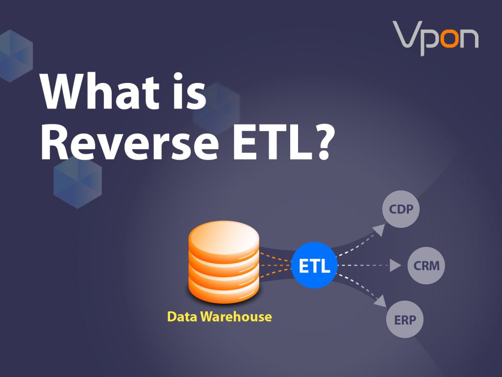
Data Control Filtering in Looker Studio is a powerful feature that allows businesses to control how data is displayed in their Looker Studio dashboards and reports. With the appropriate data filters, you can easily identify the metrics that have either a positive or negative effect on your business. Here are some examples of how this useful tool can generate helpful business insights.
Looker Studio is a free tool offered by Google, which is designed to help you monitor key performance metrics. To do this effectively, you need some way of filtering through the data. In this Looker Studio filtering guide, we’ll explore what this feature is and how to use it effectively.
Product Sales Performance
Being able to track and see your sales performance data clearly can help you make crucial business decisions that can optimize efficiency, reduce waste, & find new opportunities.
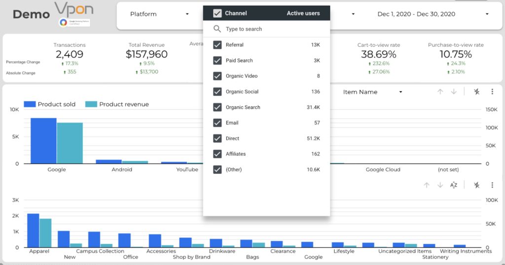
In the example chart above, we can see that Looker Studio can be used to filter the data in this bar chart by channels this way we can analyze channel performance with product categories. From here, we can discover that most users from Google bring the most revenue, and they love apparel. (The apparel category has the best performance in both sales amount and revenue aspect.)
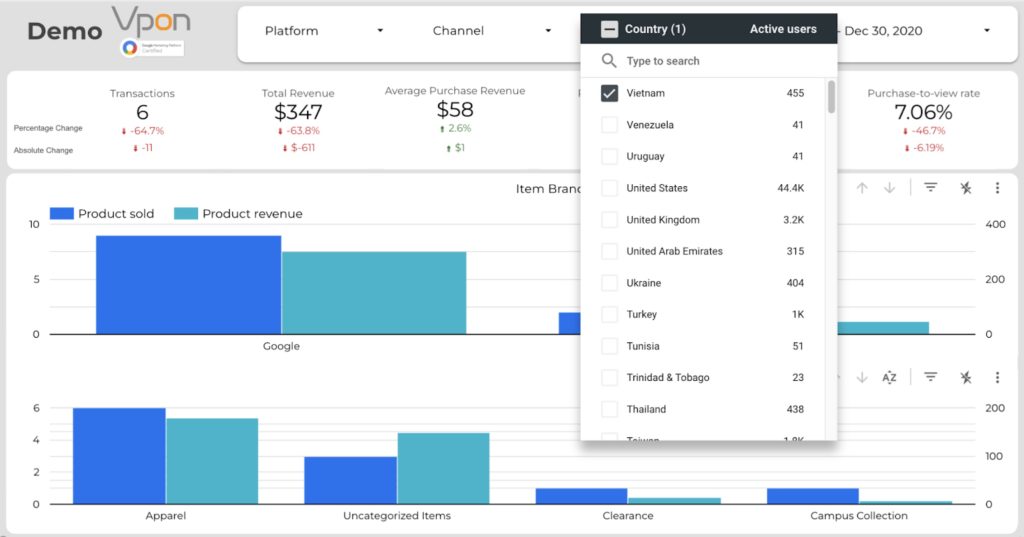
We can also filter the information by countries which can provide key insights on which product categories are doing better in selected countries. Hence using the data control filters in looker studio businesses can find new opportunities that they didn’t see before.
Advertising Performance
Measuring advertising performance costs is crucial because it helps businesses to determine the effectiveness of their marketing channels and advertising campaigns. By measuring the costs associated with advertising, businesses can understand how much they are spending, what they are getting in return, and whether they are achieving their desired outcomes.
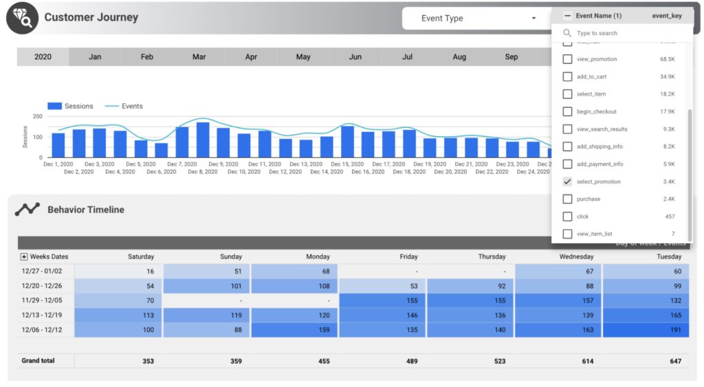
By using filter controls in our Looker Studio Report below we can use the filter controls to display data on specific events that we have in our data set. This is very powerful because we can then use this information to analyze the advertising campaigns to see how effective the campaign was and hence make changes to optimize future campaigns.
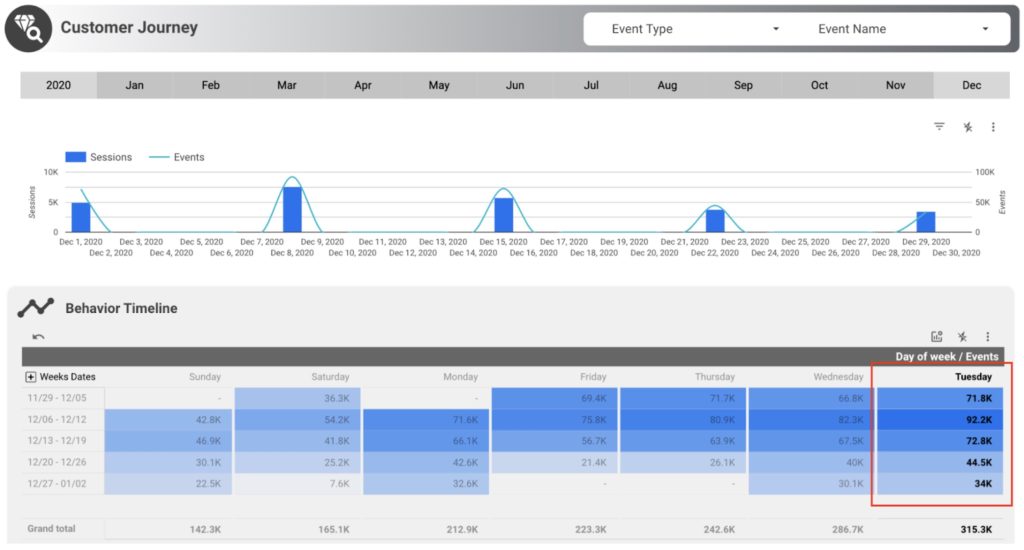
We can even select data filters to show information for specific days of the week to get even more detailed insights on why advertising performance are better in certain days of the week. Further, we can deep dive into differentiating what kind of group of the campaign is working and which are not. This is just a small part of why filtering data can be so powerful.
SEO Performance
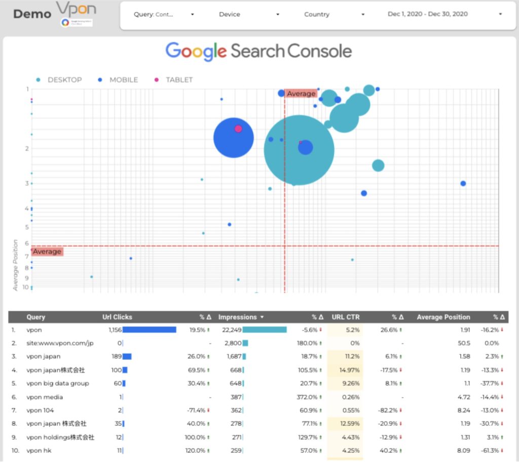
SEO (Search Engine Optimization) is a key to a brand’s success because it helps improve the visibility and ranking of a website or a web page in search engine results pages (SERPs). This increased visibility and ranking can lead to higher traffic and more opportunities for conversion, such as sales or leads. By using data controls filters and using SEO data metrics, businesses can quickly see where more focus in needed to improve SEO for the business.
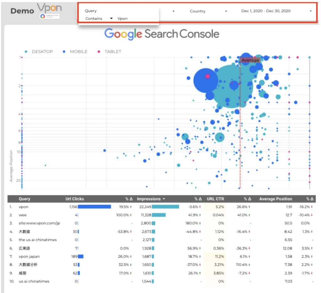
In the example above we can use Looker Studio control filters to filter the data by query. This can be used to see specific keywords and long tail keywords used for SEO. By using the control filters we can easily sort and visually see by the graphics the type of impact that this keyword has.
FIlter controls are a great way to help businesses get key insights with business data. They can be used to view a broad picture but also find more detailed opportunities & threats that the business may have. Let’s continue on and see how they work.
How Filter Controls Work
Let’s start by getting a quick overview of what filter controls are and how they work.
Filter Control
There are two primary reasons why you should use filter controls. These are:
- Change the data displayed. Consider separating the data to view what occurred over a specific period. For example, you might only want to see sales data that occurred between a particular date range.
- Adding a parameter. You can use the control to add input. For example, set up your KPI targets to monitor how close you are to achieving them.
Input Control
There are two types of controls, which can be accessed through the drop-down menu in the add a control section. The first section is used to set parameters.
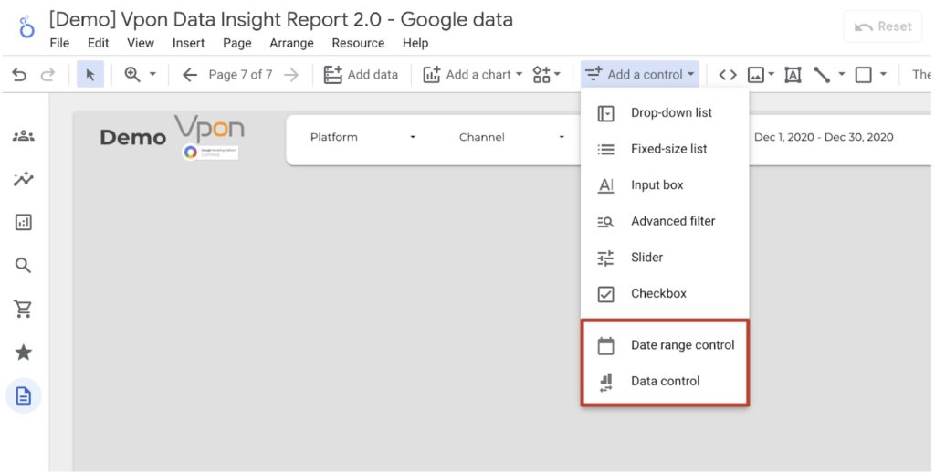
The second section consists of date range control and data control. Here is what they do:
- Date range control. This allows you to change the timeframe of a report. But you will be keeping the configuration of the report the same.
- Data control. This allows the user to change the data set the report uses efficiently. In addition, this will enable you to run a report across multiple accounts, measuring the same metrics.
Can Be Used To Change Visualization
Adding a date range filter to your account is easy. Here are the steps that you will need to follow:
- Open your report and select EDIT
- Select the element that you want to edit, like the graph or table.
- Click the SETUP button on the side of the page
- Scroll down and select the Default Date Range section. This will bring up a calendar, so you can choose the fixed dates you want to display on the report. You can also select a dynamic range. This will give you various options, like the last 7 or 14 days.
- Select Apply, and the changes will be reflected in the report.
Listing Filter Control Types, Details, And Scenarios
There is a range of ways of filtering data on Looker Studio. Let’s briefly overview what each of them does and when you might want to use it.
Dropdown
This will add a dropdown menu to the graphs. This will make it easy for you to toggle between a range of data sets. This can be useful if you want to compare a range of variables.
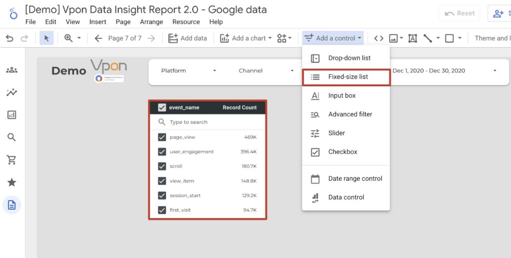
Fixed Size
This is a variation of the dropdown box system. In this case, there will be a range of variables on the side of the graph. You will then be able to select which ones you toggle on and off, allowing you to see what effect this has on the data set.
This might be the best option if you only have a few variables you want to compare. But if you analyze multiple factors across various categories, the dropdown options will often be the better choice.
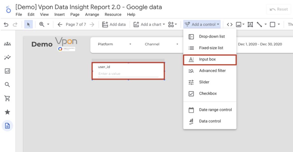
Input Box
This can be thought of as a search function. It allows you to find a specific type of data set easily. There are various ways to find the item you are looking for. As an example, you should search by the variable name.
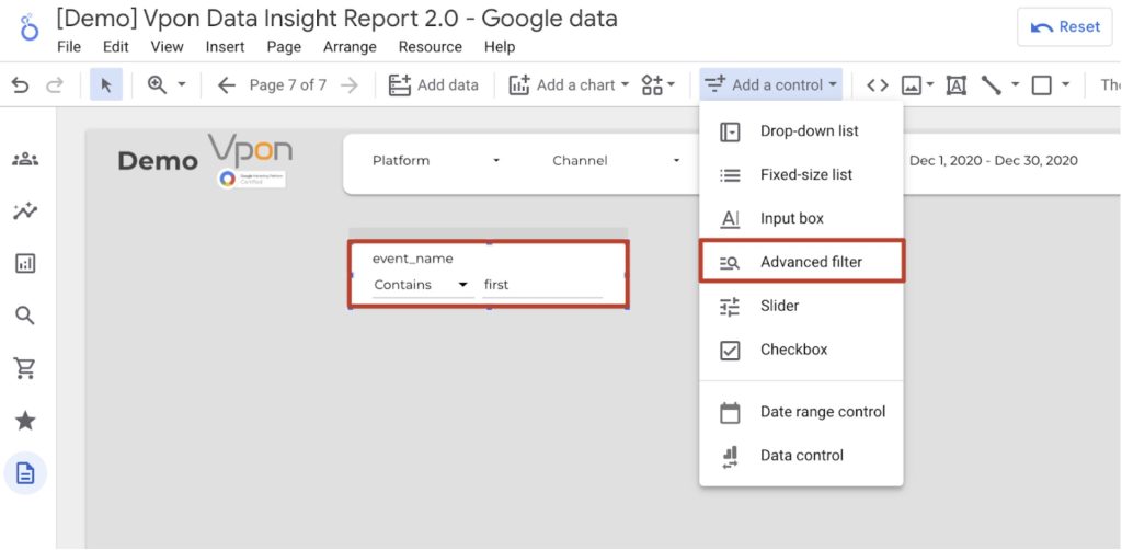
Advanced Filter
This is a more sophisticated type of input box search. In this case, you can choose the search type you will perform. You have the following options to choose from:
- Regex
- Contains
- Equals
- Starts With
- In
This will give you a better chance of finding the type of data you are searching for, particularly if navigating a complex list of variables.
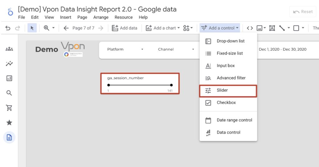
Slider
Sometimes, you will only want to include data within certain numerical limits within your report. A slider will make it easy to arrange this. First, you will need to nominate a variable. Then, you can use the slider to set the upper and lower limits. Anything that falls within these values is included; anything outside these parameters is excluded.
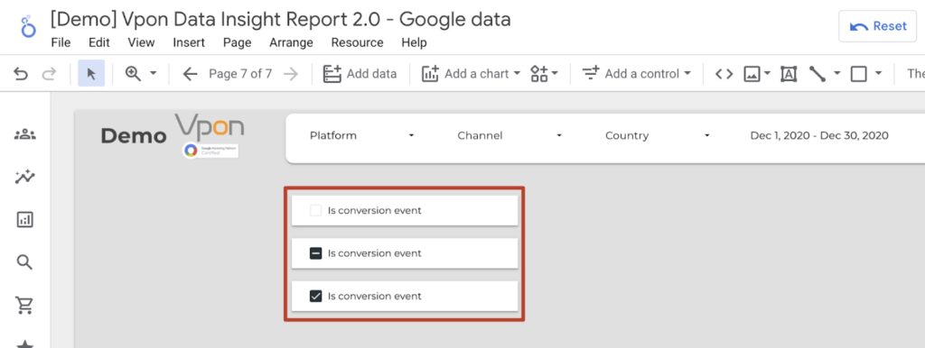
Checkbox
Finally, add a checkbox to the graphs in your reports. This will require two elements that aren’t going to overlap too closely. Through the checkbox function, you can switch a variable on and off. As a result, you can see the relationship between the two variables.
However, I recommend having one of two checkboxes per graph. Anything over this can get a little confusing to track. Consider adding a dropdown menu or a fixed-size option if you want to add more variables.
Listing Input Control Types, Details, And Scenarios
There are also two input controls that you can use. Let’s take a closer look at what they do and how you can use them.
Date Control
This will allow you to set a specific date for the data you wish to include in the report. This is designed to be a flexible approach. This makes it easy for you to find key events.
How the Date Control Works
While this seems straightforward, as we outlined earlier, you need to go to the graph and navigate to the setup and default date section. Then, you can set a fixed or enter a dynamic range of dates.
It should be noted that you can change the date range of each chart individually. Or you can have a drop-down menu that allows you to change the dates across the report. This will be the most convenient option.
To do this, here are the steps you will need to follow:
- Select the elements you want to group onto the same date range by holding Command and clicking them
- Right-click on one of these elements and select the group button
- Customize the dates through the drop-down menu at the top of the page, or set a dynamic data range.
But if you are taking this approach, you will need to ensure that the dropdown menu is connected to the date range of the individual charts.
However, there are still a few troubleshooting things that you should be aware of. This will only work if the data sets that you are using have a date range attached to them.
Data Control
The next element to consider is data control. This allows you to control which data set you are pulling information from. For example, imagine you have multiple Facebook accounts and want to compare their performance. First, you can set up a report based on one account. Then, you can switch to the other account and see the changes using the data controls.
It should be noted that, by default, this will apply to everything on the page that uses the same data set. However, there is another option you can use. You should adjust the data set used on a graph-by-graph basis. This will allow you to display data from multiple accounts within the same report.
If you are having problems, there are a few troubleshooting options that you can explore. First, check that the dimensions you included in your charts can be found within the data set. If not, the charts may appear odd, or the data may not show up. Next, it should be noted that these types of controls won’t work within an embedded report.
Conclusion
As seen in this Looker Studio control guide, there are many ways to customize your reports to include the data you want. By personalizing your reports, you should be able to get more insight into your organization and find new ways to improve. Vpon Big Data Group specializes in helping businesses, organizations, & governments discover new revenue opportunities by leveraging the power of data. Get in touch with our data experts today & let us take your business to the next level.